Hospitals & the Art of Sterile Design
- Chloe O'Laughlin
- Mar 26, 2025
- 2 min read

Recently, my younger sister had a surgery at UC Davis Medical Center in Sacramento, California. I and her fiancé accompanied her through the process; check in, paperwork, prep, and recovery. Her surgery went extremely well, and she stayed the schedule two days in the hospital for monitoring without a hitch. A little nausea but nothing more. During this ordeal, I couldn't help but be fixated with the artwork around me, specifically, the design.
Hallways of curtained rooms, beeping monitors, and scrubs; the walls were lined with signs with great promises of good doctors and cured patients. Adjacent to these promises were clip art signs with bad leading reminding patients of proper hygiene. A surreal show for a designer but fairly normal for the everyday person. I would walk the hallways looking for the bathroom or the exit distracted by bright pink paper with a picture of a dog that read "Spots wants to remind YOU to wash your hands!" In main areas and lobbies, the room was meticulously decorated with curated signs that read "For the Greater Good." One word came to mind while being a seemingly always lost ghost in the halls of UC Davis, "sterile."
Is design relatable because of personality? Because of engagement and excitement? Is that always appropriate? My questions were endless as I pondered during quiet hours, would this hospital feel better with more energetic design or is a hospital the only appropriate place for seemingly soulless design? I did some research, and by research, I mean I dived deep into the abyss of Pinterest to see if there's a balance between curated design and clipart.


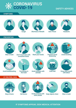
The examples I pulled I think solve different problems. Hospitals hold a wide range of emotions, most notable are both ends of the spectrum and a massive amount of middle, seemingly, unimportant situations. Overwhelming tragedy, in moments inferred and those not, on the other end, immensely deep and profound joy. How do you create important messages that resonate with all patients, truthfully speaking, you don't. In those end of spectrum moments, the last thing to be remembered will be the sign on the wall reminding patients of how to sneeze properly.


I believe it should be icon heavy. Stylized versions of tools and concepts with minimal colors and textures to create a nondisruptive depth to the design. It should be concise, simple, and have immediate recognition without the need to read for basic messages like "wash your hands" and "cover your mouth when you cough." I think hospitals are right to stay away from personalized marketing, there are too many reasons to be there in the first place. Leave the specifics to family physicians, pamphlets, and booklets with pages to fill.
In conclusion, I realized it's not feasible. In a world where technology moves a mile a minute and diseases need cures, who am I to harp on bad design?
Sources


Comments